
The photo at the top of this post is quite mild in terms of color. The smooth cream-colored cushions slope into a backdrop of hinted expression in the warm glow of the stage-front. The simple and cozy accents are elements to highlight or brighten a space; to stand out.
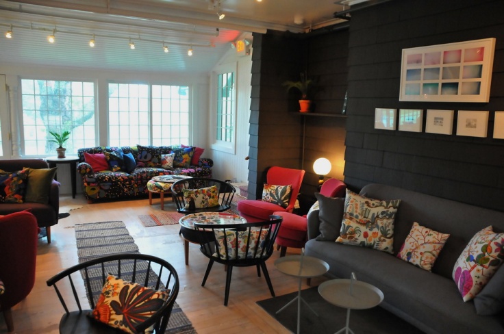
Some designers focus more on the story the pieces create together in a room, space, or office. For others, contrast expression is more their forte. Still others clamor to color– to the sensations evoked through sight and perception.
What is unanimous in color selection is the understanding that color is a key component in visual communication. It is fair to say that colors affect people’s psyche before they are even aware of it, and depending on the tone or hue, it can create a positive or negative impression before any thought is put to the task of perceiving or interpreting a room.
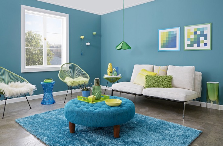
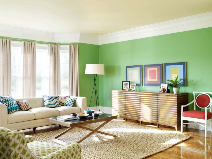
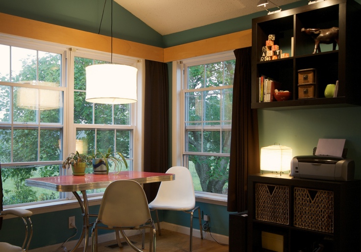
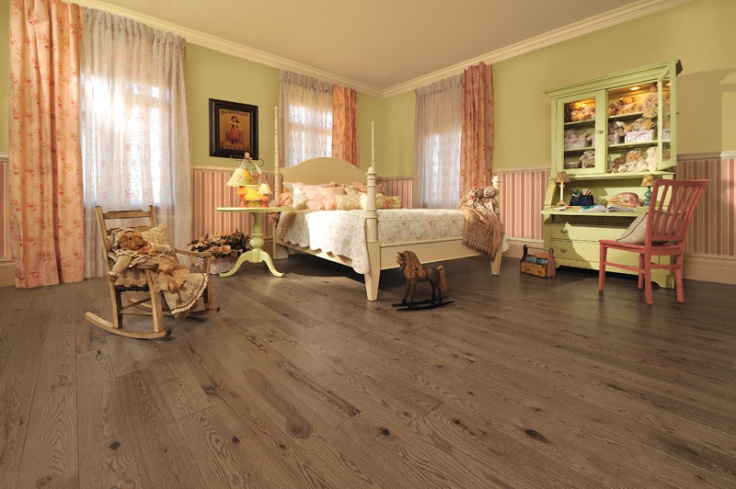
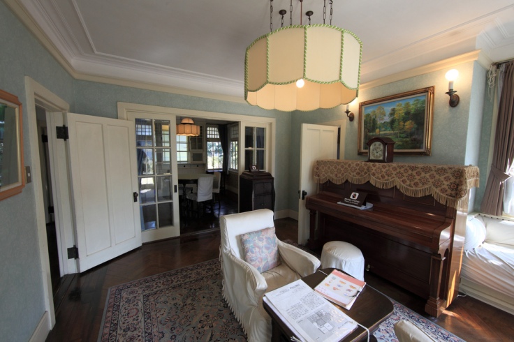
For example, if you walked into a room that was a bright, cool purple, it wouldn’t take much time to recognize that you were a overwhelmed by the fact that you’re in the room. On a similar note, if you walk into a dark, gray living room, no matter how bright and expressive the other things in the room, you’re still going to be feeling more down, like you’re sort of depressed or pulled down in mood by the surroundings. The photos below are examples of the spectrum of blue and green mood enhancing colors.
Color can be used to accent and accentuate. Some restaurants opt for more mild color schemes because they want the colors and textures of their foods to stand out and be the center of attention. Conversely, there are professional buildings when the goal is to offer colors that comfort and calm.
With some of the wall designs that we see in the marketplace, we’re tempted to turn to them as a way to add bursts of color, contrast, or design, without going overboard. Outside of these singular or correlating images, the walls can be quite bare, sending all the power of the room to the single visual draw to the design.
What’s more important with color is surrounding yourself with it. Immersing yourself within it. To make the colorful sensation even more enticing can be having textures or murals on the walls, creating works of art that surround you versus merely call you to look at it.
A prime example of this is the masterfully-created painting using Silk Plaster’s liquid wall covering. By outlining or sketching the piece on the wall, the artist was able to use varying colors to create a scene that stands out because of the realism and life size nature of the art. See the video, (filmed with Russian subtitles), here.
Another way to create patterns and designs that span the room instead of being the singular focal point, is to design something that flows a bit. In the photos below, you can see examples of multi-color uses in the contrast and flow of the design. Nature can always be an inspiration.
Colors can also communicate mood, symbolism, structure, identity, and enhance meaning.
With mood, the color in addition to the light, dark, warmth, or coolness can shape a person’s head space. That is, their psychological state can be suggested merely by being in a room of certain tones and colors. For instance, some people don’t like to go to the dentist. If a dental office paints its walls in a calming color like light blue, soft yellow, or a comforting pink, it is likely that patients will feel more at ease without even really noticing it.
Symbolism is alternately a very communicative mode through color. While a royal or bright blue can be seen as strong and confident, it can also be seen as sad or unimpressed. The context that goes with color symbolism depends both on the culture and the context of how the colors are being presented. Another example of this is if you choose to have more greens, browns, and earthy tones in the living space. This is a particularly strong sensation that makes people feel more at peace with the world around them, even if they live in the middle of the concrete jungle and there isn’t a stretch of nature around them for miles. It’s the power of suggestion that can be so strong with colors and visual symbolism.
The value of utilizing structure and color together is almost a no brainer. Our brains are wired in different ways, but establishing structure through color and design is quite useful in many ways. Websites use color to structure their articles, features, products, and even their logos. By having certain pages or columns in a particular color, they’re able to pull the reader’s attention into that specific place. The same can be said for having a dual color combination on the wall. If the lower half is darker or stands out against a contrasting white, cream, or pale hue, the people in the space are going to sense separation of top and bottom. Their attention will be pulled more to the things around the top of the room, as their legs and the bottom half of their body is noticeably part of the bottom color of the walls.
Much like the focus of the last piece, one can express their identity through color. We each have a favorite color or two, and others to which we could never imagine intentionally expose ourselves. We express our Self daily though our choices and actions, our behavior and interactions, but we also somehow express a part of ourselves by what we choose to wear and how we choose to dress. While many people have work dress codes by which to abide, those of us that don’t find a sense of freedom and excitement in expressing our identities through clothing color. It’s the same at home: expressing yourself through the home design and décor.
What does enhancing meaning have to do with our color choices in the worlds we each create? For starters, our brains find meaning whether they intend to or not. Whether it’s conscious or not. The meaning that is then created around us can be influenced by the color schemes in the place around us. A perfect example of this is the color yellow. It’s bright, it stands out, and it sort of draws the eye to it. Our attention is then focusing on something that really pulls us in; bright colors. Deepening or expanding meaning through colors can be a very stylish and, at the same time, settling thing to do.

February 16, 2017 at 2:40 pm
Thanks! It was certainly a project, but continues to be nice to reflect upon.
All the best in your endeavors!
LikeLike